12. Descriptive Statistics, Outliers and Axis Limits
L3 111 Descriptive Stats Outliers And Axis Limits V2
DataVis L3 11 V1
Descriptive Statistics, Outliers, and Axis Limits
As you create your plots and perform your exploration, make sure that you pay attention to what the plots tell you that go beyond just the basic descriptive statistics. Note any aspects of the data like the number of modes and skew, and note the presence of outliers in the data for further investigation.
Related to the latter point, you might need to change the limits or scale of what is plotted to take a closer look at the underlying patterns in the data. Let's see a few examples.
Example 1. Plot the histogram from the data having a skewed distribution of values
# TO DO: Necessary import
# Load the data, and see the height column
pokemon = pd.read_csv('pokemon.csv')
pokemon.head(10)
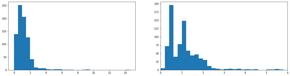
# Get the ticks for bins between [0-15], at an interval of 0.5
bins = np.arange(0, pokemon['height'].max()+0.5, 0.5)
# Plot the histogram for the height column
plt.hist(data=pokemon, x='height', bins=bins);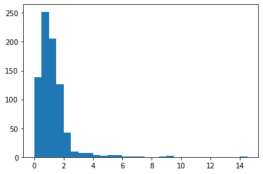
This page covers the topic of axis limits; and the next topic is scales and transformations. In order to change a histogram's axis limits, you can add a Matplotlib xlim() call to your code. The function takes a tuple of two numbers specifying the upper and lower bounds of the x-axis range. See the example below.
Example 2. Plot the histogram with a changed axis limit.
# Get the ticks for bins between [0-15], at an interval of 0.5
bins = np.arange(0, pokemon['height'].max()+0.2, 0.2)
plt.hist(data=pokemon, x='height', bins=bins);

# Set the upper and lower bounds of the bins that are displayed in the plot
# Refer here for more information - https://matplotlib.org/3.1.1/api/_as_gen/matplotlib.pyplot.xlim.html
# The argument represent a tuple of the new x-axis limits.
plt.xlim((0,6));
Alternatively, the xlim function can be called with two numeric arguments only, plt.xlim(0,6), to get the same result.
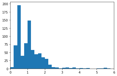
In the generic example above, we might be interested in comparing patterns in other variables between data points that take values less than 6 to those that take values greater than 6. For anything that is concentrated on the bulk of the data in the former group (< 6), the use of axis limits can allow focusing on data points in that range without needing to go through the creation of new DataFrame filtering out the data points in the latter group (> 6).
TO DO: Plot the above two graphs in a single figure of size 20 x 5 inches, side-by-side.
Hint - Use the steps below:
- Define the figure size, using
matplotlib.pyplot.figure(figsize = [float, float]). - Add a subplot using
matplotlib.pyplot.subplot(int, int, index)for the left-graph to the current figure. Then, define the left-graph. - Similarly, add a subplot for the right-graph to the current figure. Then, define the right-graph.
The expected output is shown below: